Veet Packaging Redesign Test
Veet Packaging Redesign Test
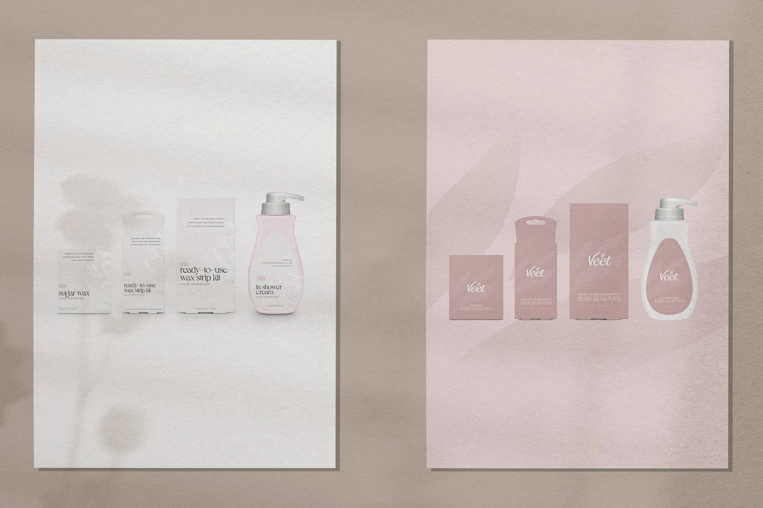
Veet was testing new product packaging and asked for a design that felt elevated compared to their current product. As someone who is a sucker for expensive products, I am drawn to minimal, clean labels. Instead of Veets current magenta, I opted for a neutral, muted mink brown color for the entire package as one concept, and OF COURSE white for another concept . To keep it clean, I kept the font either white or black. If I’m going to rip the hair off of my legs or face, I want to be calmed by the packaging.